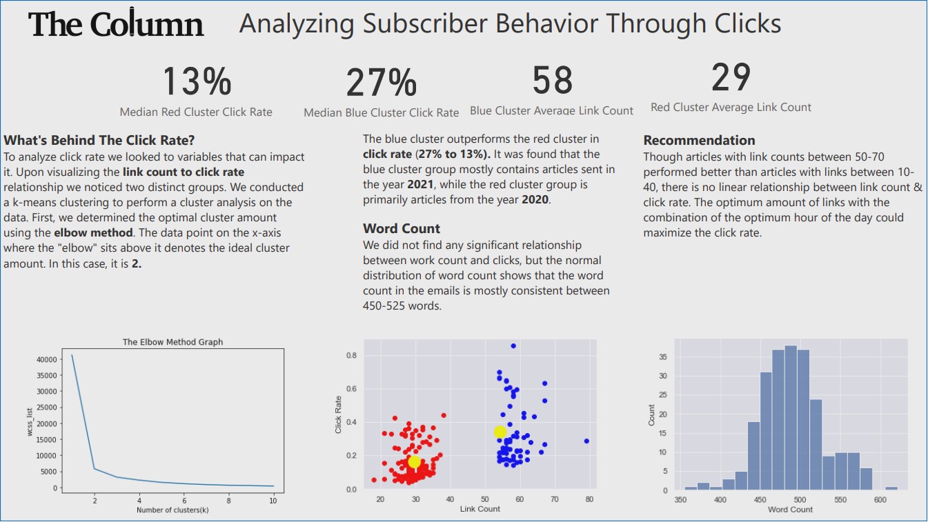
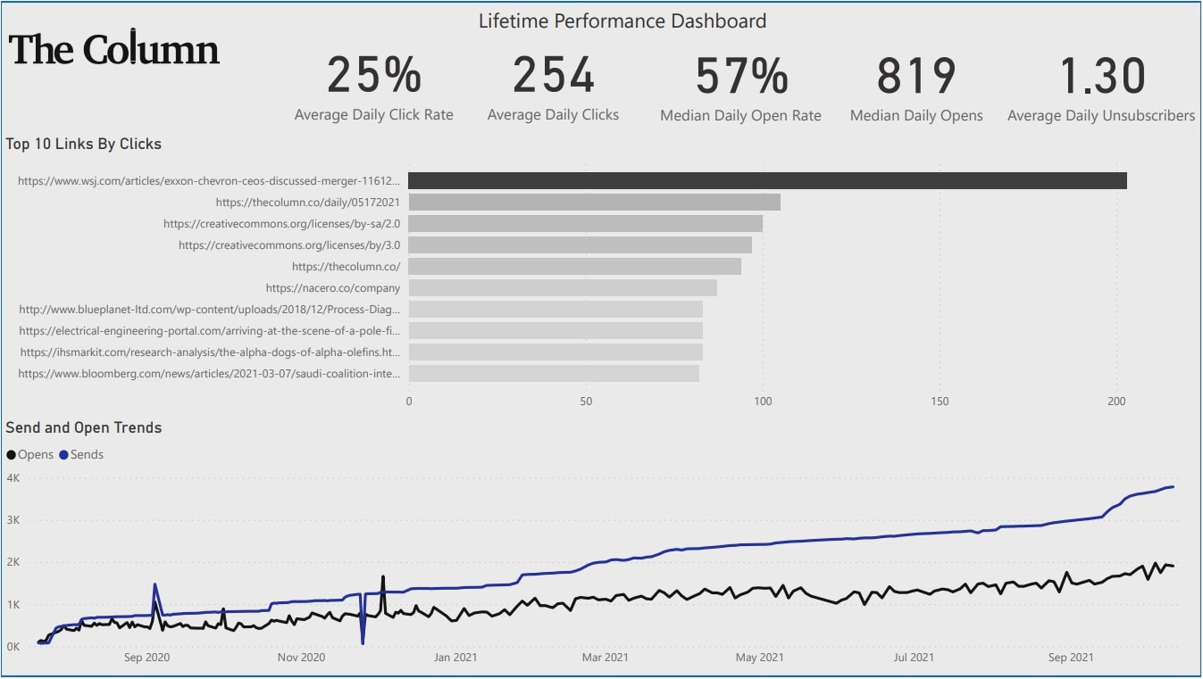
I had the pleasure in being tasked with analyzing subscriber data for The Column and providing recommendations to improve their advertising processes. Their main objectives were to increase clicks, opens, and minimize unsubscribers for their newsletter.
First I imported the required libraries
import pandas as pd
import matplotlib.pyplot as plt
import seaborn as sns
sns.set()
import plotly.express as px
import numpy as np
from sklearn.cluster import KMeans
from sklearn.preprocessing import MinMaxScaler
import scipy
import statsmodels.api as sme
from statsmodels.tsa.ar_model import AR,AutoRegResults
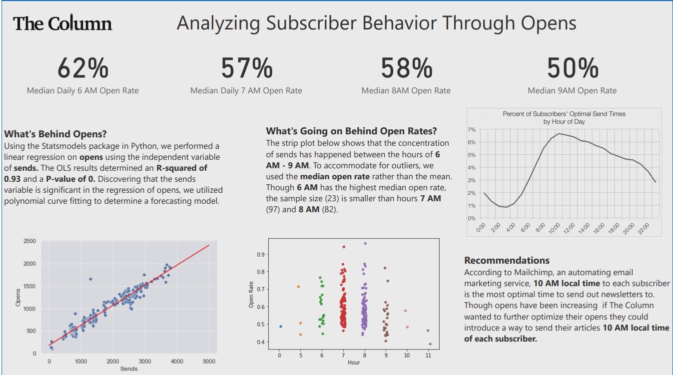
First I wanted to investigate the popular times of day that subscribers open the newsletter, I visualized a strip plot of the most common hours the newsletter is actually opened by subscribers
ax = sns.stripplot(x='Hour', y='Opens', data=summary)
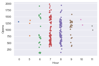
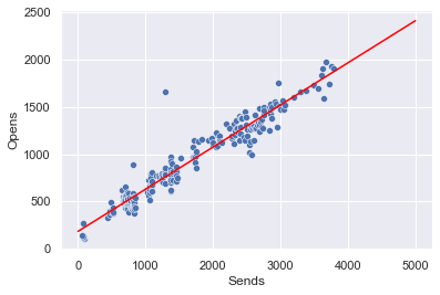
I notice that most of the time the newsletters are opened between 7-9, but the data corresponds to the time the newsletters are actually sent. I visualize a scatterplot of sends (subscriber count) and open and notice a linear relationship. This prompted me to perform a linear regression and visualize a basic model.
y = summary['Opens']
x = summary['Sends']
np.polyfit(x,y, deg =1)

potential_Send = np.linspace(0,5000,100)
potential_Opens = 0.44547871*potential_Send + 183.80574801

sns.scatterplot(x = 'Sends', y = 'Opens', data = summary)
plt.plot(potential_Send,potential_Opens, color = 'red')
plt.show()
After performing more analysis, I did research and found that Mailchip suggests that 10 AM is the most optimal time to send out newsletters/emails to subscribers. I used that as my recommendation to The Column.
